Apple’s proved you don’t need to completely reinvent your mobile line-up to succeed for years with its “S” line of smartphones. A few select changes and improvements here and there inside a similar shell can still make an enticing upgrade.
And that’s exactly what Samsung has done here. It’s taken the blueprint of last year’s Galaxy S6 and Galaxy S6 Edge and improved them in just about every way. From the camera, to the battery, to the overall feel of the phone.
The result? A fantastic, so close to perfect device that will prove tough to beat, for upcoming flagships like the LG G5, HTC One M10 and even Apple iPhone 7. We might have the phone of the year already, and it’s only March.
AMSUNG GALAXY S7 EDGE – DESIGN
Metal and glass build, curved display, IP68 water resistant, available in black or gold
Design hasn’t always been Samsung’s strong suit. Just two years ago, Samsung released the Galaxy S5. The handset was the most powerful phone available at the time, but it wasn’t a looker. Last year’s Galaxy S6 and S6 Edge signalled a much needed change for Samsung, and the change is only more obvious with the S7 Edge.
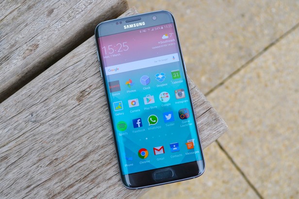
The Galaxy S7 Edge is downright gorgeous. In my eyes, it’s the best looking phone ever and makes the iPhone 6S Plus look blocky, boring and dated.
On the surface, the S7 Edge looks just like its predecessor. A metal rim is sandwiched between two slabs of Gorilla Glass 4, with a lock switch on one side and separated volume keys on the other. The back is almost completely clean, with a now flush camera sensor, heart rate monitor and a Samsung logo.
Along the top is the repositioned sim-tray, which now pops in a microSD slot too, plus a microphone. The bottom houses the headphone jack (this should always be on the bottom, can other manufacturers please take note), another microphone, a tiny and frankly disappointing speaker, plus a microUSB port for charging.
Rumours suggested Samsung was going to make the switch to the new, reversible USB–C connector that’s already being used on the Nexus 6P, OnePlus 2 and LG G5, but it hasn’t panned out that way. This isn’t really a bad thing, in fact USB–C is more of a hindrance than a help at the minute. Especially as it means getting rid of all those microUSB cables you’ve accumulated over the years.
The front is almost as clean as the back, and features an elongated home button set under the display, plus another Samsung logo – does it really need two?. Unlike the HTC One A9, the front control is a physical button, not a capacitive pad. The front button houses the Galaxy S7 Edge’s fingerprint sensor, which is just as fast as all the others on the market now.
Samsung has once again decided not to use on-screen buttons, so glowing ‘back’ and ‘multitasking’ keys light up when needed. Ditching virtual buttons gives you more screen space, but this phone could be even more compact if Samsung went down that route.
Samsung’s also redesigned the Galaxy S7 Edge’s camera module. Unlike the S6’s, the S7 Edge’s module sits flat on the phone’s back. This might sound like a small change, but it makes a big difference. I can now tap out a text with the phone flat on my desk without it jumping and rocking from side to side.
But, the biggest change between the S6 Edge from last year and the Galaxy S7 Edge is the size. Instead of simply keeping both the Galaxy S7 and S7 Edge the same, with just the Edge sides to differentiate them, Samsung has positioned the Edge as the ‘higher-end’ device, pushing up the screen size from 5.1-inches to 5.5-inches.
When I first heard Samsung made this changed, I was a little annoyed. There was something unique about having a fully-powered phone with a screen that was on the small and compact side. It’s a rarity these days. Pick up the S7 Edge though, and you might have to double to check the spec-sheet, surely this phone doesn’t have the same size screen as the iPhone 6S Plus?
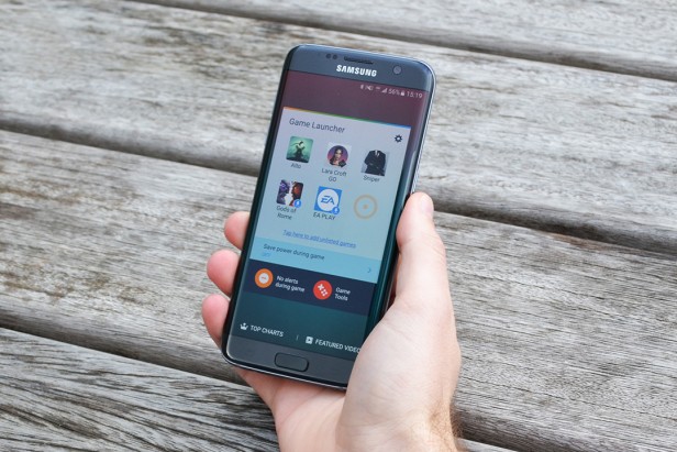
Yet it does. Somehow Samsung has managed to cram a large screen into the body of a much smaller phone. Next to the iPhone 6S Plus, the S7 Edge is narrower, shorter and much lighter. I can even use it comfortably in one hand, stretching my thumb from one corner to the other without too much trouble.
There’s something else the size increase helps too: those gorgeous, sloping curved edges. The Galaxy S7 Edge is the fourth Samsung phone to use this design trait, but it’s the best implementation I’ve seen yet.
The S6 Edge was difficult to hold for an extended period, while the Galaxy S6 Edge+ was simply too big. The Galaxy S7 Edge, though, is just right. There’s enough space between where the curved screens stops and the back starts to grip, while the newly curved back – reminiscent of the Galaxy Note 5 – slips nicely into my palms. In short, it feels great to hold and it’s an impressive feat by the Samsung design team that these slight changes have made such a big overall difference.
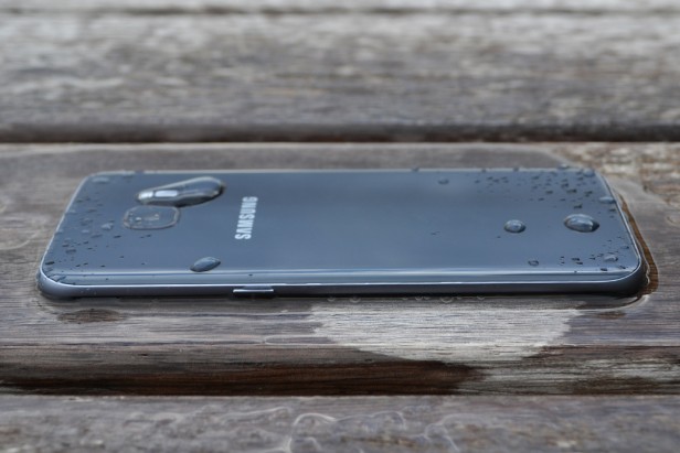
Just like the microSD slot, Samsung has brought back another fan favourite from the Galaxy S5; an IP68 rating for water-resistance. While this is by no means a vital feature, it’s admirable that it has been added without any noticeable loss to the design. There are no flaps covering the ports, no added thickness and no extra space between the display and glass.
What does an IP68 rating mean? Well, you’ll be able to dunk the Galaxy S7 Edge into one meter of water for up to 30 minutes without damaging the phone. Basically, you can use it in the rain without issue and even watch some YouTube in the bath without worrying about an accidental slip. Not that I did that, honest.
SAMSUNG GALAXY S7 EDGE – SCREEN
5.5-inch quad-HD panel, dual curved edges
If the design of the S7 Edge is stunning, then the same word can be used to describe the display. Not a whole lot has changed from the outgoing flagships, but this still holds up as the best screen on a smartphone for a number of reasons.
First up is the sheer amount of detail here. Samsung didn’t try and go all-out with a 4K display, but really when quad-HD (that’s 2560 x 1440) looks this good I don’t think there’s much of a need for more pixels. Maybe it would help make VR even better with the Gear VR headset, but that’ll probably come next year.
Everything from images to films to games look beautiful, with pixels completely invisible to the naked eye. The 534ppi (pixels per inch) density beats the iPhone 6S Plus and means the S7 Edge easily outmuscles Apple’s phablet in the display department.
Samsung has stuck with its Super AMOLED tech for the Galaxy S7 Edge and that’s not really a surprise. AMOLED screens are much more vibrant than the LCD counterparts. Oversaturation isn’t as much of a problem as it was on older Samsung phones, and personally I like a bit more ‘oomph’ to my colours. But for those that like a cooler look there are options to tone things down.
AMOLED displays are also much better at showing off blacks than LCDs. Instead of looking slightly grey, the blacks here are inky deep. You’ll easily notice this when watching media and it’s hard going back to an LCD afterwards.
Now, there are a few niggles I have with the display on the Galaxy S7 Edge. There’s a really strong blue tinge on the two edge sides, especially when viewing content with white background. In both Twitter and Gmail I can pick this out and while it won’t come across in pictures, it’s annoying.
Viewing angles also aren’t the best. But, that’s really one of the sacrifices you get when you don’t use an IPS LCD panel. Tilt the phone to an angle and the sides become bright white, but the rest of it looks like it’s masked in a grey fog.
The new ‘Always-on Display’ mode, is also cool but needs some work. The Always-on tech takes advantage of the fact AMOLED screens don’t need to light up the whole display all the time and can instead select individual pixels to charge. This means the S7 Edge can still show the time, date and a couple of bits of other information on the lock-screen when the phone is off without eating through too much battery.
Samsung says having the ‘Always-on display’ switched on will only use up an extra 1% of battery per hour and those claims stand true during my testing. Samsung also says you should save battery because you don’t unlock the phone as much with Always-on activated, but I disagree with this.
Yes, the Always-on mode shows the time, but it will only alert you to notifications from Samsung’s default apps like Messages, Mail and Phone. Use WhatsApp? Or Gmail? Tough, these won’t show up.
I’d also like a bit more control over the mode. You can’t alter the brightness, which causes some problems when you’re in a darker room, and aside from choosing whether or not you want a calendar showing, there isn’t much customisation allowed.
It’s a nice start and a feature that has potential to be very useful, but it needs work.
Source: Trustedreviews
----------
If you liked this article, please subscribe to our YouTube Channel for tech news, reviews and video tutorials. You can also find us on Twitter, Instagram and Facebook.


One Comment
Leave a ReplyOne Ping
Pingback:Samsung Galaxy S7: The phone for gamers