It seems positively bizarre to type, especially since I have been covering the company for nearly a decade now, but Nokia is no longer a cell phone maker. Once the largest phone vendor on the planet by a staggering margin, Nokia sold its devices and services business to Microsoft and will now wear a number of new hats as it looks toward the future. One of those hats, as it turns out, is that of an Android developer — and the company’s first big software announcement is a shockingly impressive one.
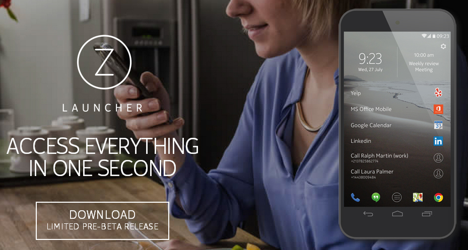
Nokia on Thursday took the wraps off of Z Launcher, a truly novel home screen replacement for Android phones.
Android launchers often get lost in trying to differentiate. They also sometimes attempt to pack too much onto each screen. Z Launcher takes the exact opposite approach, stripping away all the noise and displaying only a few key items.
At the top of the screen are the time, date and one upcoming calendar event. Tapping the time will open Android’s clock app and tapping the calendar event will open the phone’s Calendar app.
The remainder of the screen is dedicated to just a few apps, contacts and web pages.
Five static shortcuts appear at the bottom of the screen, while the majority of the launcher screen is occupied by six additional shortcuts. These items lead to a combination of apps, contacts and web pages that you open most often.
Z Launcher is constantly learning and evolving based on your usage patterns. It remembers the apps you use most frequently and monitors what times of the day you use different apps. The same holds true for contacts and web pages. The launcher then displays the content you’re most likely to use at any given time.
But what about all the other content on your phone? Here’s where things get really interesting.
My favorite feature of Z Launcher is “Scribble.” With this nifty feature, everything on an Android phone is just a few swipes away.
Scribble allows users to scribble letters anywhere on the launcher screen in order to open an app. So, for example, if the user wants to open Twitter and it’s not currently on the screen, he or she can simply scribble a “T” and then a “W” on the display.
As each letter is drawn, a list drills down apps, web pages and contacts until the desired item is tapped. Z Launcher remembers the content you access most often and it will surface those items higher each time you scribble. So next time a “T” is drawn, for example, Twitter might be the first result.
Web searches can also be performed by scribbling letters on the screen.
Z Launcher is a very nifty offering from Nokia and it has the potential to completely change the way you use your phone. Smartphones are all about apps, plain and simple. With Z Launcher, your most used apps take center stage and everything else is a few short swipes away.
Nokia’s Z Launcher app is currently available for free as a pre-beta release, and it is compatible with most modern Android phones. I have been testing it for about a day on a Nexus 5, and I have been quite impressed with the app. Also of note, I have not run into any issues despite Z Launcher’s early beta status.
Users interested in trying the app can get it from Nokia’s new Z Launcher website, where a limited number of downloads are available.
----------
If you liked this article, please subscribe to our YouTube Channel for tech news, reviews and video tutorials. You can also find us on Twitter, Instagram and Facebook.


Samsung just started working on the copy.
Lets see what Samsung will come up with