Last year’s Moto G took us all by surprise. Sure, we knew Motorola wanted to reinvent the cheap smartphone experience, but the very first device in the company’s cost crusade was even better than we expected. Let’s be honest, though: The G’s greatest asset was its small, small price tag. For $180 off-contract, it became awfully easy to forgive the thing for not being the quickest, the prettiest or the smartest. Still, it was one of those gadgets that wound up being more than just “good enough”; between the price and performance, the Moto G was one of the best cheap smartphones you could own, period.
Here we are less than a year later, and we’ve got a sequel to play with (one with the same name, no less). If you took a quick peek at what it brings to the table, you’d be forgiven for thinking that Motorola wanted to play it safe the second time around — the new Moto G isn’t a game changer, and it doesn’t have to be. Does this year’s model clear the “good enough” bar once again? And just how far will $180 take you this year?
Moto G (2014)
PROS
- Camera is much better than the original’s
- Near-stock Android 4.4.4 is a treat
- Feels snappy despite aging internals
- Inexpensive
CONS
- No LTE
- Screen isn’t as crisp as last year’s model
Motorola’s wallet-friendly formula hasn’t changed much since last year’s Moto G, but that’s OK — the company changed just enough to make the 2014 version one of the best budget smartphones out there.
HARDWARE
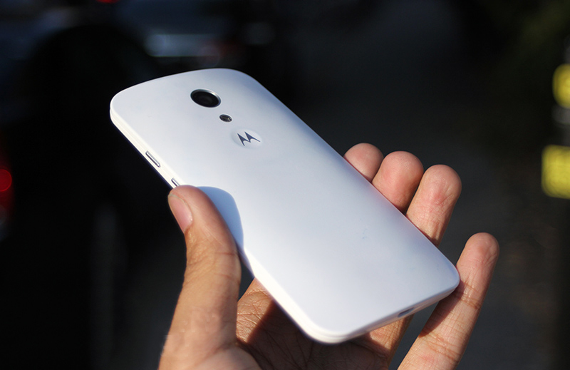
I don’t mean to sound cynical here, but if you’ve seen one modern Motorola smartphone, you’ve just seen them all. Seriously. Motorola is still enamored with those curved backs, clean faces and dimpled logos. Other details of the design are carryovers too, including the headphone jack centered along the phone’s top edge, and the faintest hints of color circling the 8-megapixel rear camera. All of that taken together means this year’s Moto G looks an awful lot like last year’s batch of Motorola handsets with just a few notable differences.
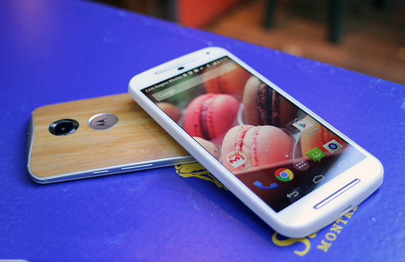
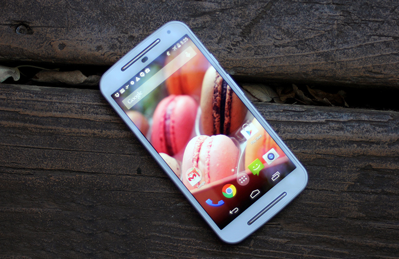
For one, a more expansive, 5-inch 720p display fills the front — it’s barely bounded by bezels on the left and right, while a shiny pair of front-facing speaker grilles above and below the screen helps the G pull off a convincing Moto E impersonation. You won’t notice the tiny, white notification light next to the pinprick of a front-facing camera until someone shoots you an email or writes on your Facebook wall, though your eye will occasionally dart to the proximity sensor sitting below the topmost speaker (especially if your phone is white, like mine was). That’s about it in terms of visual flair — the G in its default state is as subtle as ever, but you can trick it out with any number of Motorola’s colorful backplates and cases.
As it turns out, that bigger screen winds up being a blessing and a curse. Your apps and emails have more room to stretch out and breathe, but this year’s Moto G is also a little less comfortable to hold because of it. That’s a shame since Motorola did an outstanding job making the new Moto X feel slimmer than it is by tapering the sides. Here, those edges are flat and substantial, and while they don’t make the phone feel small, they do give your hands more surface area to grip — not a bad deal for any butterfingers reading this. You might also notice a hint of slack between the removable back plate and the rest of the phone, but that’s just me being nitpicky.
If you thought the Moto G’s looks were more of the same, just wait until you see what’s lurking inside. This year’s model has the same quad-core 1.2GHz Qualcomm Snapdragon 400 as its predecessor, along with the same 1GB of RAM. That both generations of the G basically share a brain isn’t necessarily a bad thing — we quite enjoyed the horsepower we squeezed out of it last year — but I couldn’t help but hope Motorola would use a more powerful configuration this year.
The similarities don’t end there either: Both versions of the G run with the same non-removable 2,070mAh battery, which, at first blush, seems a silly choice. Why would anyone stick the same ol’ battery in a new device with a bigger screen to light up? It’s another one of those price-performance balancing acts Motorola had to cope with, and since this thing has the same brain and the same lack of LTE support (HSPA all the way) as the original G, I guess popping in a more powerful cell wasn’t deemed crucial. If it makes you feel any better, though, there’s now a microSD card slot behind the back cover to supplement the meager 8GB of storage, and an alternate version of the phone sports two SIM card slots instead of one.
DISPLAY AND SOUND
Of all the surprises that first Moto G brought to the table, its 4.5-inch, 720p screen was one of the most pleasant. Impressive clarity? Accurate colors? Solid viewing angles? The original G had them all, and the sequel’s 5-inch display fares almost as well. Yes, almost. There are a few bummers at play here, but the most notable is the slight dip in sharpness since the screen uses the same number of pixels to fill even more space. If you’ve got a spare moment, you can peer very intently and pick out those individual pixels; you’re ultimately left with a screen that looks softer and less crisp than the one that came before it. The bigger question, though, is how much that actually matters. My answer? Hardly at all. It’s not going to be a dealbreaker for anyone but the most persnickety screen hounds.
More importantly, the Gorilla Glass 3-clad display is spacious, bright and plenty vivid, though colors didn’t seem quite as poppy and saturated as they did on the original Moto G. Personally, I prefer it when colors border on lurid (gotta love those AMOLED screens), so the screen feels just a little lifeless to me. Of course, though, your mileage will vary on that one. Alas, things take a turn when you start looking at dark pages or videos: My review unit has some pretty noticeable backlight bleeding at four discrete spots near the center of the screen. Those stray photons shouldn’t be terribly bothersome for most, but my eyes couldn’t help but gravitate toward them while poking through a dark app or sitting in dimly lit rooms.
On the plus side, the silver-trimmed speakers bounding that screen are a damned sight better than the single, wimpy driver that sat low on the original G’s rear end. The difference is dramatic — they get louder than you’d expect without getting too muddy or distorted — but don’t expect any HTC One-style auditory revelations when you crank things up.
SOFTWARE
Hate bloatware? Love the buttery smoothness of unfettered Android? You’ll find plenty to like here. We can actually keep this bit short and sweet: The Moto G’s build of Android 4.4.4 is just about untouched, a feat that (for better or worse) wasn’t replicated by its big brother. Sadly, this also means that the thoughtful tricks the Moto X could pull off are nowhere to be found. This shouldn’t come as a shock: The G still lacks the additional processing cores that made those tricks possible, but they’re hard to give up if you’ve used them (or have seen them in action) on a Moto X.
With the exception of Motorola’s Migrate, Assist and Alert apps, there’s just about nothing non-Googly in origin here. Thankfully, those apps occasionally come in pretty handy. As the name implies, Motorola Migrate lets you transfer messages, contacts and calendar events (whatever doesn’t come through when you set up the phone with your Google account, really) from another Android phone or straight from Apple’s iCloud. Assist pitches in when it can tell you’re in a meeting or when it’s your bedtime by automatically silencing itself.
Alert, on the other hand, is a sort of a location-based, catchall app where you can broadcast your location to friends (à la Glympse), as well as set up notifications for preset contacts and emergency services if you ever feel you’re in danger. Setting up that list of important contacts doesn’t take more than a few moments, and triggering the emergency mode is just as simple — a single tap of a button initiates a 5-second countdown before your phone starts reaching out to everyone on the list. All told, it’s a largely dummy-proof lifeline should your situation go south in a heartbeat. Here’s hoping you won’t ever need to use it as one.
CAMERA
None of the smartphones that Motorola pieced together over the last 12 months have had cameras that have blown us away — care to take a guess at how the Moto G fared? Bingo! Welcome back to the middle of the road, at least compared to the current crop of smartphones floating around the market. That might sound like I’m damning the G with faint praise, but believe me: The 8-megapixel sensor Motorola’s got in there is a big, big improvement over the 5-megapixel camera in last year’s model.
As usual, photons are your friends and you’re going to want as many of them around as possible if you want to coax your Moto G into performing its best. Under those conditions, expect to see lively colors and a bountiful amount of detail (the fact that HDR is set to “Auto” by default usually helps with that). It actually does pretty well once the light starts to fade, too — graininess becomes a problem after a while, but the sensor is more than capable of coping when the sun dips behind clouds or starts to inch closer to the horizon.
----------
If you liked this article, please subscribe to our YouTube Channel for tech news, reviews and video tutorials. You can also find us on Twitter, Instagram and Facebook.


