Apple is readying a new version of the software that drives its iPhones, iPads, and iPod touches, Which will be launched in September. It will be free too.
The iOS 9 will run on the iPhone 4s, iPad 2, iPad mini, or iPod touch fifth generation — or later models.)
The iOS 9 version looks and feels just the same as before, you won’t notice much changes. But hundreds of little tweaks that are intended to make its mobile devices faster, smarter, and more stable has been made.
If you are eager to take an early look at iOS 9, you can download the public beta version this week by signing up here. But you must understand that it’s not finished and you may experience some bugs.
App-switching screen has been redesigned
The “cards” that represent your open apps now overlap, so that more of them fit on a single screen.
longer battery life
On average, Apple says every iPhone will get a full hour more of life from every battery charge.
It eked out this extra juice by making a long list of tiny tweaks. One example: If your phone is face-down on the table, the screen no longer lights up when you get incoming notifications.
[ad name=”Responsive”]
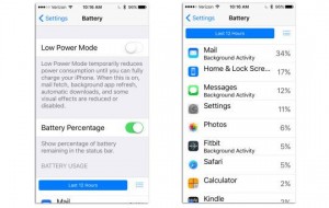
Low Power Mode
There’s also a new Low Power Mode, clearly inspired by the similar feature on Android phones. You can turn it on at any time, in Settings -> Battery — but you’ll be invited to turn it on when your battery sinks to 20 percent and again when there’s 10 percent left.
Bye-bye to four-digit Passcode
You now need a 6-digit Simple Passcode to unlock the phone. Bye-bye, four-digit Simple Passcodes. (You can, of course, still create passwords of any length and style if you turn off Simple Password. And you can still use your fingerprint on recent models.)
Upgrading Process
Even the upgrading process has been upgraded. Now you need only 1.3 free gigabytes on your phone to perform the OS surgery. Not 4.6 gigabytes, as before. If necessary, the phone will even ask if it can delete some of your apps to make some temporary room for the upgrade process. It also promises to put them back at the end.
And the “Upgrade now?” screen offers more choices for the timing — like “Tonight” or “When I use my phone least.”
[ad name=”Responsive”]
Continuity Feature
The Continuity feature, introduced last year, lets you make and take calls on your Mac or iPad, which acts as a speakerphone extension for your iPhone. (The phone, which must be in the same Wi-Fi hotspot, acts as a sort of remote antenna.) But now there’s Continuity over Cellular, so far available only from T-Mobile, which lets you take calls on your Mac or iPad even if your iPhone is somewhere else in the world! Yes, even if you left it at the office or at your friends house.
Move To iOS
Apple introduces Move to iOS; a new app that brings nearly all your stuff from an Android phone or tablet over to your new iPhone or iPad, wirelessly and automatically. Afterward, you’ll find your iOS gadget fully stocked with your contacts, email accounts, calendars, wallpapers, text messages, photos and videos, and Web bookmarks. It will also transfer your songs and books — at least, the ones that aren’t copy protected.
On Screen Keyboard
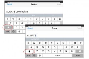
The letters on the onscreen keyboard now change from uppercase to lowercase when you engage the Shift key. (In the old days, they were always capitals. If you prefer that arrangement, open Settings -> General -> Accessibility, and turn off Show Lowercase Keys.)
- In the bad old days, evildoers could learn your passwords by watching the little pop-up balloons that appeared above your fingertips when you tapped the onscreen keys. Not anymore. You can turn those balloons off in Settings -> General -> Keyboards -> Character Preview.
- Usually, notifications appear in chronological order on your Notifications screens. But now, in Settings ->Notifications, you can turn on Group By App, which clusters the alerts by app.
- If you’ve hopped into one app (say, Safari) by tapping a notification or a linkin another (say, email), you canthen hop back into the first app by tapping a little button in the top left corner, skipping the intermediate step of opening the app switcher.
Search Screen
Apple has even given the Search screen some love. It starts out full of icons for the people, apps, places, and news it thinks you might be interested in right now. You can also search for thingsbeyond what’s on your phone now, like sports scores, weather, stocks, calculations, unit and currency conversions, and documents on your iCloud Drive.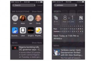
Minor Tweaks:
- Settings -> Photos & Camera: You can now specify the frame rate (30 or 60 frames a second) for standard video and slow-mo video. Higher frame rates, of course, eat up more space but give you smoother playback.
- Search your Settings. There’s now a Search box at the top of Settings. So if you’re not sure which category to tap to find — say, Larger Text or Ringers — the OS can help you out. (Which is lucky; Settings has turned into a bureaucracy the size of the IRS.)
- To reveal the Search box, you can either swipe down from a Home screen, as you could in iOS 8 — or you can swipe the first Home screen to the right, as you could in even earlier iOS versions. Yes, the first Home screen is now the Search screen once again.
- The much despised Podcasts app has finally had a redesign.
- In Safari’s Reader Mode (which conceals all ads and other distracting elements from something you’re trying to read), a new Aa button lets you specify the background color or typeface.
- If you want to see all the Web passwords Safari has memorized for you, you open Settings -> Safari-> Passwords. But now you can’t see the stored passwords without using your Touch ID fingerprint (provided you’ve set one up).
- The Health kit app now adjusts when you turn the screen 90 degrees, showing you, for example, a wider graph of your health data. There’s a new Reproductive Health section for women, too, where you can record variables like Menstruation, Ovulation Test Result, and — in what’s certainly a first in a major consumer operating system — Cervical Mucus Quality.
[ad name=”Responsive”]
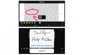
You can now mark up PDF files and graphics attachments at the moment of sending them. You can circle a typo on a document, draw arrows on a diagram, and — this is the best part! — drop in your actual signature on a contract. In other words, the iOS Mail program now has exactly the same markup features as OS X Yosemite on the Mac.
If you’re sending a PDF or photo, hold your finger down on it to make the options bar appear; tap Markup. If you’re receiving one, hold down on the file attachment’s icon, and then tap the Toolbox icon.
Now you get four icons at the bottom of the screen:
- Sketch lets you draw freehand in your document — and marvel as iOS cleans up your lines, if you like. For example, if you draw what’s more or less a diagonal line, it can straighten it and make it a perfect 45 degrees. If you draw what seems to be a box or a circle, Preview zaps it into perfection.
- Loupe. This option creates a magnified circle on a piece of the photo you want to emphasize.
- Text. Click to place a text box on the image. You can drag it or reshape it — and, of course, you can replace the word “Text” inside it with much superior words of your own. Use the Aa button to choose a font.
- Signature. This button invites you to add your finger-scrawled signature to a pop-up list, so that you’ll be able to drop it into contracts. As a handy bonus, your phone starts out showing whatever signatures you’ve saved on yourMac, in Preview.
Minor Tweaks:
- You can now add file attachments of any type to outgoing Mail messages (not just photos or videos). To do that, hold your finger down anywhere in the message, and then tap Add Attachment in the button bar that appears.
- You can also save any file attachment from Mail to your iCloud Drive. Just hold your finger down on it to see the option to do that. Slowly but surely, the iPhone and iPad are becoming more like real computers; theiCloud Drive has, in essence, become iOS’s folder system.
- When you’re editing a list of email messages, you’re no longer condemned to tap every message individually when you just want to mark, move, or delete them all (or most of them). New Mark All, Move All, and Trash All buttons now appear at the bottom.
Camera
As our phones become our cameras, photo and video options become increasingly important. There are zillions of helpful touches in iOS 9. For example:
- Until iOS 9 came along, you could attach at most five photos to an outgoing email message. Now the limit is 15 photos.
- You can finally zoom in on a video! Use the same pinching/spreading two-finger gesture you’ve always used on photos. Supercool, really.
- You can also turn the video-recording light on and off at will, during the capturing of a single video. Genius.
- In the Photos app, once you’ve opened a photo for viewing, there’s a row of photo thumbnails at the bottom, which make it easier to jump around in your collection.
- In iOS 8, Apple added the Hide button for a photo, so that you could keep less-lovely items like screenshots, whiteboard shots, and diagrams out of your Moments, Collections, and Years photo sets. Now you can hide more than one photo at a time, thanks to the Hide icon that now appears on the Share sheet.
- It’s a lot easier to select a lot of photos at once— before sending or deleting them, for example. Once you’ve selected one photo, you can just drag your finger across any others you want to include, rather than tapping them individually. Three in this row, four in this column, whatever. (Drag again to un-select them.)
iPads
A few of iOS 9’s goodies appear only on iPads. For example, when you’re typing, you now get buttons for Cut, Copy, Paste, and basic formatting. They appear on the Quick Type bar (where you see the iPad’s guesses as to the next word you might want to type). Other companies’ apps are allowed to add buttons to this bar, too.
This is cool, too: If you drag two fingers across the onscreen keyboard, it acts as a giant trackpad. You can, in other words, move your cursor or insertion point through some text as though you had a mouse. After you spend a minute learning it, you’ve got yourself a more efficient way to select, edit, or move text forever.
----------
If you liked this article, please subscribe to our YouTube Channel for tech news, reviews and video tutorials. You can also find us on Twitter, Instagram and Facebook.


